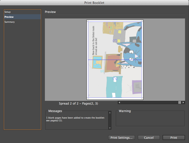
Software wise I feel I've made a lot of progress on Photoshop as I now know how to make the lines on my drawings more defined and I know how to make a colour layer.I've learnt about the RGB and CMYK colour settings which have helped with the colour on my book. In Design was a new experience but I feel I've made a lot of progress on it as I know now how to create a story book layout with a front, back and spread page. I've also learnt about the new 'bleed' settings when printing the book; this gave me trouble at first but I soon learnt about it and fixed the print settings accordingly.
This is my first time using InDesign; I've learnt how to set up a new book document with pages as you can see here:
I simply just typed the number of pages I wanted(In this case four because I needed a front, back and double spread page). I also picked the A3 type paper due to my research leading me to see that children's books are normally bigger then adult books with their pages containing much more images and content.
As you can see I've already scaled the picture to properly fit the print setup. But if I hadn't it would've bled to the outside of the borders which in turn would make the book look slanted or distorted.

Here are both my books; one is printed with the pages 'bleeding' out of the border(Left) and the other is properly formatted(Right).
I chose the font 'Hobo Std':
As you can see I chose it due to it's fu and formal look; the curved font connotes to the audience that this book is for children but the boldness of the font connotes a smart, formal look.
I was going to choose the 'Brush Script Std' font but I decided against it due to the possibility that some of the audience may not be able to read font in this style.
I also considered the 'Bookman Old Style' but I chose not to have it; simply because I did not feel it stood out as much as the 'Hobo Std' font choice.
As you can see in the image below there are white margins where the image would be cut off and thus there would be more empty space/stylistic choices such as roses or petals coiling around the empty space. You can also see an example of this below.
I did not choose to have any empty space for my book as I felt the more content I could fit on the page would mean that a child would pay attention to the book for longer.


