Tuesday, 16 December 2014

Bath Mums Questionnaire Results

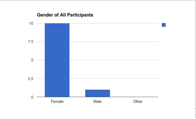
This graphs shows the gender of all participants.  As we can tell from this graph; the majority of participants were female. This is expected as the site is called and probably contains 'Bath Mums'.

From this graph we can see that the majority of those questioned were over 30. This would denote the  fact that many parents are over 30. 


From this Graph we can see the majority of the children that were cared for are aged between 0-4, three other careers children are aged between 4-6 and 6-8. We can see now that all of the children are under 10.  


Re-Analysed Data

Above is the data I analysed from the 'Bath Mum's' website. Now I am analysing some of the answers from the recent questionnaire filled out by the childcare course students. 

Only one person voted for the '19-25' age bracket, this is the same with the '25-30' age bracket nobody voted for the '30+'. From this graph we can see that the most popular age range is '18 or Less' with the amount of votes being 9. This is because the environment of college is predominantly made up of younger people learning how in the child care course. 

In contrast the 'Bath Mums' questionnaire's main age bracket was '30+'. This could signify that 'Bath Mums' is predominantly made up of older mums while Bath College is made up of younger people willing to learn about childcare.

One of the other questions asks 'What is the best method of receiving a story or information?'. The 'Paper Book' had 12 votes, the 'Audio Book' format had 1 vote and the rest of the options were not picked. I believe the 'Paper Book' format won because digital versions of children's books haven't been fully incorporated in the present but maybe in the future when digital storybooks will have been incorporated to the extent of paper books then the votes may change.

Another question was 'Favourite genre of children's book?'. The result that came out on top was the 'adventure' genre the rest of the genres did not get any votes.


Tuesday, 18 November 2014

The 180 Degree Rule

The 180 Degree rule

The main use of the rule is to establish an establishing shot to show a scenic area such as a park and also to the maintain actions of the characters on screen; you do this by establishing a line of action. This line is normally placed in-between two actors(it's preferable that one is facing left and the other right when standing still and talking); or along a path that the character is moving from. The 180 degree comes into play when you establish the line of action on the two subjects then place a camera on the side you have chosen to use; this camera is now part of the 180 degree arch on one side of the action line. You can now place your cameras at any angle on the 180 degree arch you have allocated and still not break the sight line. In contrast if you place the camera on the opposite side of the action line then the actors are facing the opposite direction then they were previous; this may confuse the audience.

Another example of the 180 degree rule is when an actor is walking. Imagine the action line is the path the actor is walking across; now if you place a camera on the left side of the line you can freely switch between angles and still know which way the actor is walking. In contrast if you place the camera on the right side of the action line while the actor is still walking then it will appear to the audience that the actor has turned and walked in the opposite direction. A good example of a moving action shot is in any sport in which a player is running sown the pitch to a goal-line(for example football). During the tense moments in which the player is running with the ball to score a point on the opposite end of the pitch switching the camera to the opposite side of the action line would confuse the viewer as it would show the player running in the opposite direction.

You can however switch cameras to opposite sides of the action line to add effect; for example if a character is drunk and stumbling through the street you could switch action line sides to induce a feeling and confusing to the audience.

Monday, 17 November 2014

Colours

Colour Association 

Personal Association

Red- Aggression, Anger, Rage, postbox, skittles, traffic, danger

Orange- Peaceful, oranges, basketball, sun, skittles 

Brown-  chocolate, dirt, rust, mud, 

Yellow-  fear, bananas, the sun, skittles, traffic, gold, danger
Green- grass, sickness, forest, jungle, rainforest, skittles, traffic

Blue- water, ocean, tranquility, the sky, curtains, police, skittles 

Purple- night,  chocolate wrapper, skittles  

Black- hair, dark, night, deep sea

White- clouds, paper, clear, 

Grey- sad, depressed, rain, clouds, old, boring 

Wednesday, 12 November 2014

Alien Cards

Alien Card Analysis

I first had to do secondary research to find trading and competitive card games, when I had found the card games I copied and pasted the description and rules of the card games I had found. Then I had to fill the style column; in this column I had to list the styles of the card’s images(for example a card may have a holographic or a drawn image on it) and the theme of a card deck(for example there may be a dinosaur themed Top Trumps deck). At home was where the secondary research was carried out; for example I had dug up some old Pokemon cards and analysed the conventions of it then I had added it to the card research sheet.


Having to explain the styles and themes of the cards I was analysing jogged my creative thinking; this was because I had to learn and remember about the different styles used in each cards for example 3d, holographic and drawn. This also helped me choose a style for my alien trading card game. Researching the rules to each card game helped me figure out what the rules for my game could be; eventually I chose a to use an altered version of the Top Trumps rules.


One graphic process was the gaussian blur, this is a technique used to blur whole or selected parts of an image on Photoshop. I used this tool along with the lasso tool for mainly the background area of my card; the lasso tool was used to isolate the two of my characters at the front and the gaussian blur was used to blur the background to a certain extent. I also used the Feathering technique which blurred the lines that the lasso tool had highlighted and separated and added a filter to make the background darker.


I experimented with the HDR toning effect to turn some images ‘hyper realistic’; this put emphasis on some of the colours on the image to give it some depth. I’ve learnt that you don’t just use presets before starting a project on Photoshop and that you may have to customise it beforehand. For example when I was making the trading cards I had set length and the width to 64 and 89 respectively, after this I set the resolution to 300 to make sure the image isn’t fuzzy lastly I had set the colour mode to ‘CMYK’ which stands for cyan, magenta, yellow and key. This was to make the colours match some of the filters used.


I mainly chose the feathering technique along with the gaussian blur; this was to help my characters stand out. Blurring and adding a filter in the background helped disguise many of the people in the background and mold them into shadows; this gave the card a much more dark and threatening feel to it.


I didn't have many changes throughout the final product but I did chose to add a feathering effect mixed with a filter instead of just choosing a filter on it’s own.


Yes and no; firstly I thought designing it would be easy  due to already being dead set on a format I had designed previously. I had a change of mind on a couple of occasions that lead me to choose a different more unique design path.


Yes I am happy overall with the graphic process and the result of it. I would however choose to edit the characters in the foreground rather than the background in future. This is because the image’s effects look like they just stop after approaching the characters in the foreground.

Bionicle Research


Bionicle is a subset company of Lego and it became one of Legos biggest selling properties since it launched during 2000 in Europe and Australia while being released in 2001 in North America. It is aimed at 5-16 year olds.


Strengths


  • Bionicle has a narrative that keeps fans engaged and sets it apart from other construction sets without stories.
  • Bionicle is relatively easy to assemble.
  • Bionicle looks unique and has their own collectible pieces such as masks and sets.
  • Bionicle is colorful and that helps distinguish characters and sets.
  • Toy statistics have revealed that 85% of American boys aged 6–12 have heard of Bionicle while 45% own the sets.


Weaknesses


  • Bionicle storyline may leave potential buyers confused and instead buying sets such as Lego.
  • Bionicle’s aesthetic appearance may lead audiences to believe it is not suitable for children.
  • Bionicle lost a critical amount of sales leading to it’s cancellation.


Manual

Bionicle’s manual is easy to understand and simple. This is due to its catalog of items, for example the box at the top left indicates how much of each piece there are. The steps are also clearly labeled and the steps are numbered.