Three Different Healthy Drinks
Innocent Smoothies
Branding
Firstly the logo looks as if it were drawn by a child, this drawing connotes innocence due to it looking like a childs drawing and children are often associated with innocence. The logo’s drawing looks like an angel due to the halo located above the character’s head; this denotes innocence due to angels often being associated with everything pure and clean.
As you can see the website also radiates a feeling of positivity due to the smiling people and goofy objects located on the bottom row. Innocent sells healthy smoothies, because this is the case one of the main elements of the website is trying to live a healthy lifestyle. An example is the segment that states “January is hard, show winter who’s boss” this connotes a feeling of determination which is often associated with exercise. Also the man in the picture is wearing a hoodie which connotes a sense that he has to wear something comfortable to exercise.
Another element of the site is ‘fair trade’; we can see this with the man on the left segment who looks like a worker with a field behind him. He is smiling so this may connote a sense that he is getting a ‘fair trade’ for his fruit.
Advertising
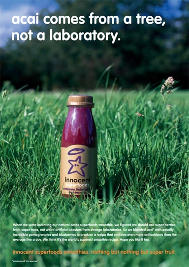
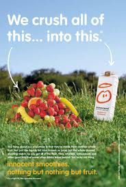
These are two advertising posters that can be found in cafes and shops selling Innocent products. Both these posters have an underlining theme of all natural and freshly made fruits; we can see this with one subtitle which states “acai comes from a tree not a laboratory.” and “We crush all of this(arrow pointing to a pile of fresh fruit)...into this(pointing to a Innocent smoothie carton).”. Because of the ‘freshly made’ themes both these posters connote a sense of living healthily and a healthy diet.
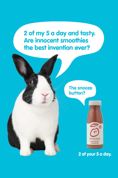
This advert takes more of an comedic approach rather than the heavy handed approach of the previous two adverts. Firstly we see the rabbit talking(rabbits have a mostly healthy diet due to being herbivores) about Innocent contributing to “2 of my 5 a day”; this could connote to readers that they may not have to eat fruit if they have two innocent smoothies a day(there is also a subtitle on the bottom that tells the reader this piece of information). The comedic element of the poster is the the bottle making a comment that implies that the snooze button on an alarm may be the best invention ever; this aspect is to attempt to make the poster funny and relatable.
Packaging Elements and Colour
These are Innocent’s main bottles; the design of the bottle connotes innocence due to the small size and light coloured packaging. Each bottle looks similar, because of this the bottles rely on the colour of the actual drink liquid and then after noticing the colour the potential customer may read the flavour subtitle on the front of the packaging.
On the actual label we can see that Innocent are further trying to cement their brand as a healthy drink as the subtitle under the name is “pure fruit smoothie”; the term pure fruit denotes that the drink is healthy and could be used as one of the five a day.
Language
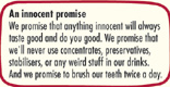
The language used on the label suggest that Innocent is a brand trying to live up to it’s namesake; for example the box with a yellow outline’s heading is “an innocent promise”. it then goes onto list things that Innocent promise never to do; “we’ll never use concentrates, preservatives, stabilisers or any other weird stuff in our drinks.” is what the text states. The language connotes that Innocent can be trusted and is a friendly face in contrast to the mostly faceless drink industry; we can see they are trying to be friendly due to stating “or any other weird stuff in our drinks.” after a string of complex chemical names. This shows us that the company understands not everybody will understand the terminology and instead cuts right to the chase.
Another use of attempted bonding with the audience is with the use of humor right at the end of the text which is “And we promise to brush our teeth twice a day.” This is just humor and an attempt to form an emotional connection with the audience by making them laugh.
Price
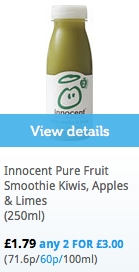 (Tesco)
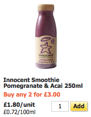 (Sainsburys)
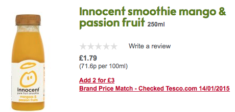 (Waitrose)
All of these prices are £1.80 or £1.79, this is surprising due to healthy and organic products normally being rather expensive(for example a healthy bottle of juice may be £5.00 while a bottle of Coke may be £2.50). Also for these three examples there seems to be a deal that offers two or three bottles for the price of £3.00. This may appeal to people who are trying to save you money and want to eat and drink healthily.
Target Audience
If we compile all this evidence together we can tell that one of the factors of targeted demographic must be fit or at least active; This is due to the drink being a fruit smoothie also due to some of the words and phrasing such as “we’ll never use concentrates, preservatives, stabilisers or any other weird stuff in our drinks.”
The ages of the target audience could vary as the drink is small and called Innocent which would also suggest that some of the audience could be children.
2. Volvic
Branding
This is the Volvic logo it’s imagery is a mountain but could possibly also be a volcano due to the dip at the top of the mountain as well as the name Volvic. Around the logo is a water spouting in a circle this is just in reference to Volvic being a water company. The logo’s mountain and water spout connote a sense of clean or cleansing water; this is due to mountain water often being associated with cleanliness and often being portrayed with a purifying effect on people. The volcano aspect could connote a sense of freshness due to volcanos normally destroying old land only to be replaced with a fresh new land.
The website backs up the fact that the mountain is in fact a volcano. The website plays on the themes of a volcano due to a number of factors; one factor being the countdown timer that is stating when the volcano will erupt. There are also themes of ‘freshness’ and ‘cleanliness’ due to the lush green fields on the volcano and the plants growing in the foreground.
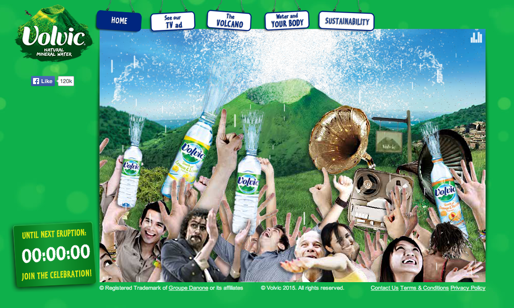
Below is an image of the volcano erupting; as we can see there is not lava but in it’s place is water. Around the volcano are a group of people holding bottles and musical equipment; they seem to be celebrating the volcano erupting.
The phrase ‘Join the celebration’ below the counter also reinforces the fact that it isa time for celebration.
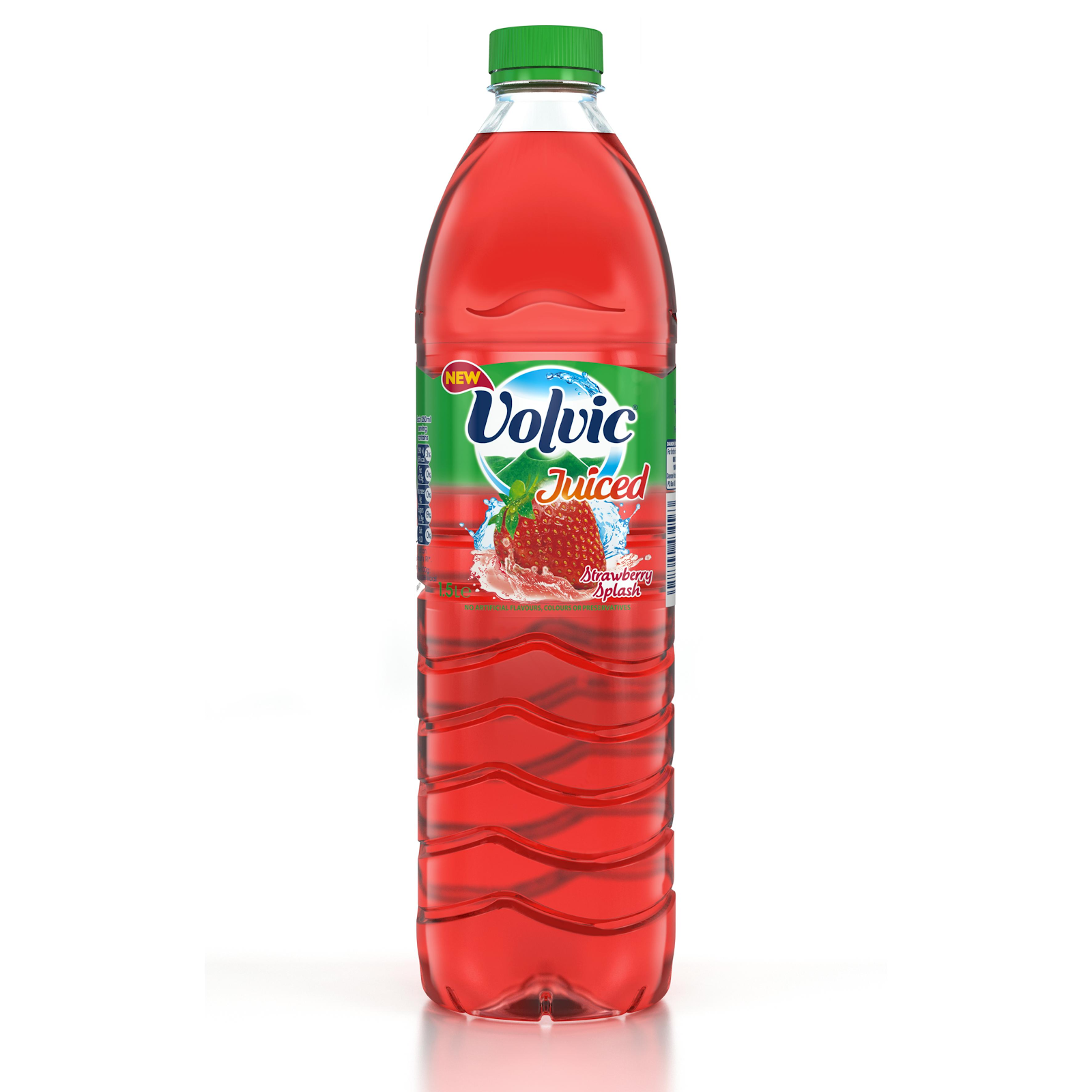
Volvic has also released a number of other drinks under the Volvic brand, the most notable being the ‘Volvic Juiced’ line of drinks depicted here:
These drinks help cement Volvic’s reputation as a healthy drink. It also helps volvic stay unique and varied as people may only see Volvic as a plain water product.
Advertising
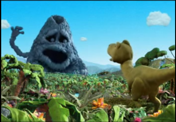
This is a still shot from one of Volvic’s TV adverts. As you can see the characters are puppets and the environment they are in seems to be made from a soft felt material. This advert could appeal to children due to it’s fun nature; it may indicate to children that water(but more specifically Volvic) is not just a boring adult drink but it can also be a fun drink for children. The characters are also fun and non-threatening; this is further sign the advert is aiming at children because if it were adults then the characters would look a bit more realistic and possibly be in cgi.




Volvic also has a more adult themed TV advert as we can see the beginning of the advert depicts a dry and grey earth. It looks like it has been baron of water for a while. Below is the end of the Volvic advert as we can see the earth is a lot greener and there are more brighter colours; this denotes rejuvenation and regeneration. The second shot shows a volcano with the phrase ‘Unstoppable Volcanicity’ which might mean that the Volvic drink will have an unstoppable refreshing taste and effect on the potential buyer.

This last advert connotes sense of a healthy and green lifestyle. It depicts a toppled Volvic bottle with the water inside it producing plants. The phrase ‘Volvic Regenerates’ further cements the fact that this drink will help you feel fresh when you are exercising or if you are in a tense situation.
Packaging Elements and Colour/Layout
This is Volvic’s label on it’s bottle. As you can see it’s rather plain and colours are light but it does not stand out that well. The blue sky sort of blends in with the water in the bottle; this creates a sort of illusion that may capture a potential buyer's attention a couple of seconds more than an average water packaging.
This is a label from one of the ‘Volvic Juiced’ drinks. This label is much more bright and stand outish compared to the previous one. The label has a more graphics on it for example the strawberry splashing into the water is very detailed. The flavour is in small text located below the image; this may be because Volvic think that the consumers may identify the flavour with the image of the strawberry and the colour scheme.
Colour wise the Volvic plain water bottles don’t have any other colours apart from light green and light blue. Colour’s only really come into play with the addition of the ‘Volvic Juiced’ series as the colour of the drinks help customers understand which flavour each drink is. For example the strawberry image above is mainly red and strawberries are mainly red.
Language
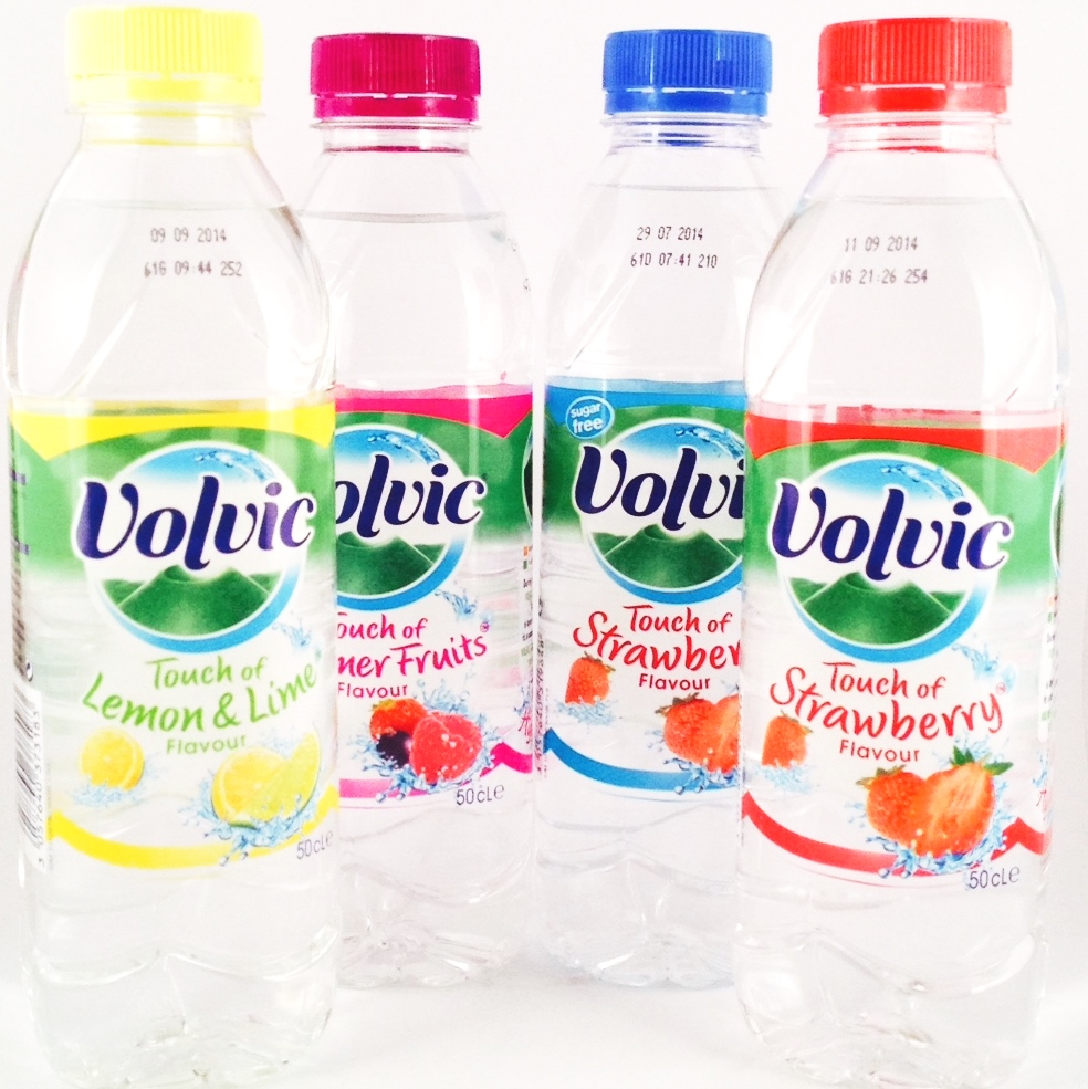
The language on Volvic packages are very limited only to name and maybe the flavour name. In the image above we can see an offshoot of regular Volvic drinks; the main phrase used is ‘a touch of’ this means it keeps still tastes like water but with only a slight difference with the additions of lemons, summer fruits etc.
Price
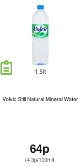

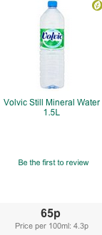
Price wise a single bottle of Volvic seems to be priced within the 60p-65p bracket. This may be because Volvic wants their product to be accessible and affordable to a wider market. This could be to promote healthy living a 65p is cheaper than most fizzy drinks; it could also be because Volvic understands water can literally come out of the tap so they sell water cheap to sell more bottles and to not come under criticism for the price.
Target Audience
Volvic seems to be targeting everybody with their advertising, adults and children. Volvic’s main themes seem to be rejuvenating and refreshing because of this the drink may be automatically attractive to those with an active and healthy lifestyle.
Oasis
Branding
While not possessing an actual logo(image) the way in which the Oasis brand name is styled contains a big connotation. The connotation is that the ‘O’ in the Oasis looks wavy at the sides of it; this is sort of like seeing a mirage in the desert. Mirages often tend to be Oasis’.
Considering all of this the name Oasis is very inventive as Oasis’ are known to be rare and a treat for thirsty people. Runners or people that are thirsty may see the drink and picture fruit; this will lead them to believe that Oasis would be healthy then alternative’s such as Coke, Pepsi or any other competitors.
Oasis does not have an actual website but they do have a sub-section on the Coke website; below you can see what the section has to offer. All we can see is ingredients and nutritional properties; this will be good for customers who just want to get down to the actual properties of the drink.
Advertising
Here is an advert that would be shown after the TV show “Celebrity Juice”. As you can see the drink itself is positioned directly in the centre of the set with a number of prop objects and food surrounding it. The phrase “It’ll go with anything” is shown below the Oasis name; the phrase connotes that you can have any food with the drink but the foods surrounding the drink are mainly healthy in nature. This further connotes that the suggested food would be healthy.
Packaging Elements and Colour/Layout
As you can see the average Oasis bottle is very colourful; it should be noted that the bottle is also smaller than other drinks bottles. The colours can be attributed to the fact that the drink is trying to advertise itself on flavours and one of the best ways to do that is to help the customer colour associate with actual fruits. The size could either be because more drinks could be brought if the consumer takes a short amount of time to finish the first drink and then wants another. Or this could be because the Oasis company wants to connote the fact that the drinks should be consumed in moderation so the size bottle they provide you with is the ideal amount you should have. The former is more likely.
Price
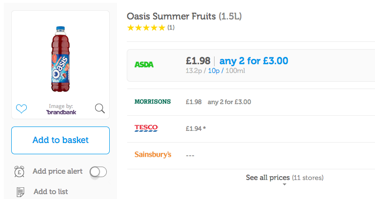
You can see that Asda and Morrisons offer the drink at the same price and offer a 2 for £3.00 deal. Tesco offers 4p less than the competitors but does not offer any “2 for 3” deals.This is because the bottles are small and selling them for the same amount as a large coke bottle would not be good for business